Creating authentic connection in the age of algorithms is indeed possible.
The attention economy seems to be holding all of the marketing cards these days. With algorithms training on our every click and glance, what we pay attention to online is becoming more tailored and curated with every scroll. So how do we, as marketing professionals, connect on a meaningful level when everything we consume seems to be designed to trick us into paying attention? Add to that, how do we get through to the most digitally savvy, discerning generation?
Being on the receiving end of marketing these days is like going on a first date with someone who has talked to everyone you know before you even meet face to face. It feels very one-sided and suspicious, if not a little creepy.
Let’s remember that though the algorithm decides what we see, it doesn’t create the content. We do.
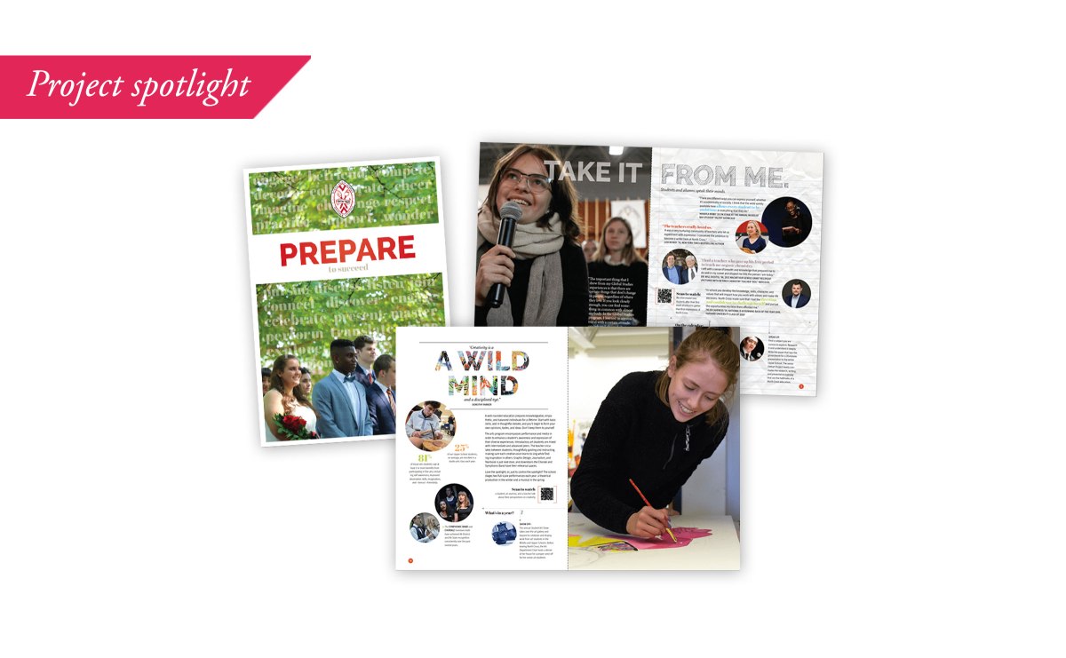
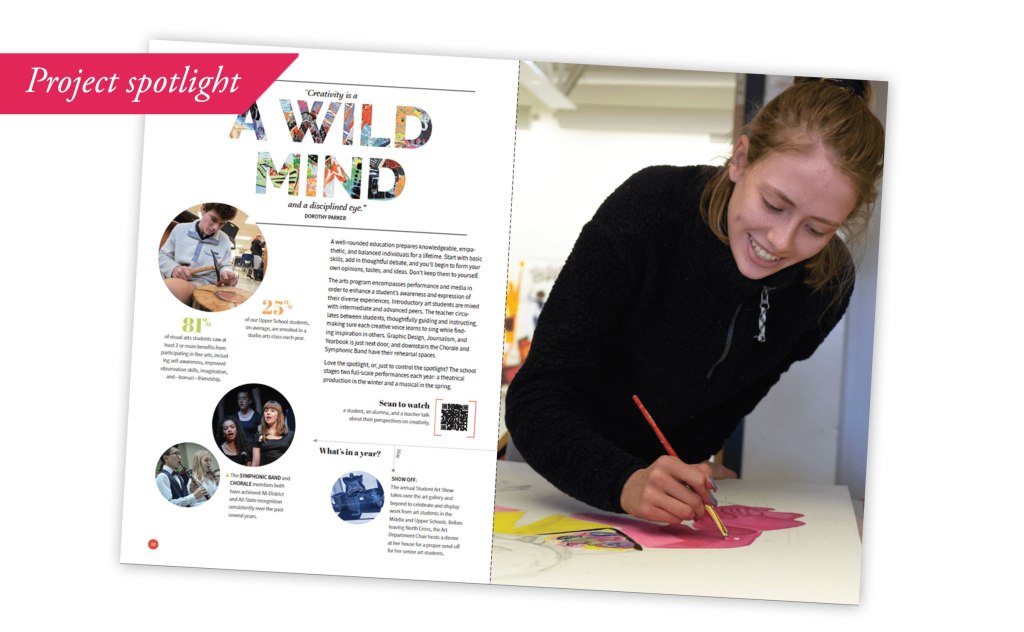
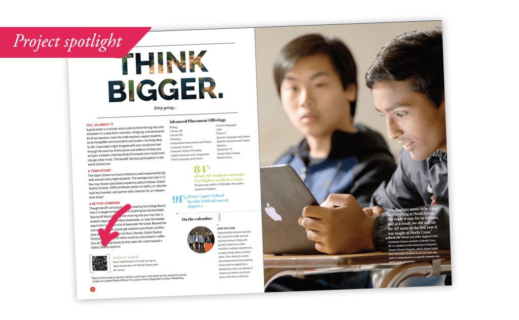
I was tasked with finding ways to stir up more social media engagement for a small, all-girls independent high school so as to attract prospective students. The old inclination would be to tout the school’s college acceptance stats or financial aid awards, its excellent faculty and course offerings. Yawn. Keep scrolling.
In order to convince high school students (who have more say in their school choice than, say, a kindergartner might), we needed to connect on an emotional level. We need to address what is holding them back from applying versus what is pushing them forward. The forward stuff is easy. Their parents probably won’t shut up about the benefits. But who is addressing the girls’ concerns?
Enter social media. The prospects are on it. We have the tools to find them. Now, how do we engage them in a meaningful way?
To create an authentic experience, put yourself in the mindset of the person consuming the content. This might seem like a no-brainer, but what we adults may be proud to share as institutions may not resonate with the young person we want to reach.
Great. One small problem: I was 13 when phones still had cords.
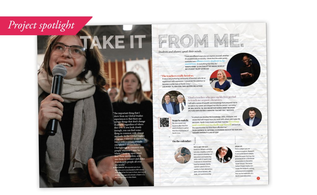
So, I solicited a wide range of current students and asked them to create some short-form videos answering a range of questions that an incoming student may have which ultimately address the bigger question: “Can I see myself here?” I called it “show and tell,” and let the students direct where and how they would create their answers. I cast a very wide net so as not to insert my own opinions or goals into the conversation. Here are a few of the questions the students were asked to answer:
- What would you tell a prospective student who might be worried about attending an all-girls school?
- What surprised you most about your experience so far?
- When you leave what do you think you’ll miss the most?
- If you are fluent in a language besides English, what would you say to a girl who also speaks that language about what you love about [school]? Please provide an English translation at the end of the video or English subtitles.
The goal was not to have them spit back a manufactured list of bullet points in order to sell the school, but to show the school’s authentic self: a collection of smart, confident young women with ideas who are eager to share them, who are varied in their backgrounds and achievements, and who represent a wide spectrum of students so as to attract only the prospective students who can and want to see themselves there.
So, don’t be scared of the algorithm. That’s just one part of the equation. It shows you where the door is, you are in charge of the truth that is revealed when your audience opens it. If what they see rings true and honest, chances are you’ll rise above the fray and connect. Why? Because it came from a real, human experience, not a fact sheet. The goal is to go to the source. That’s where the truth lives.