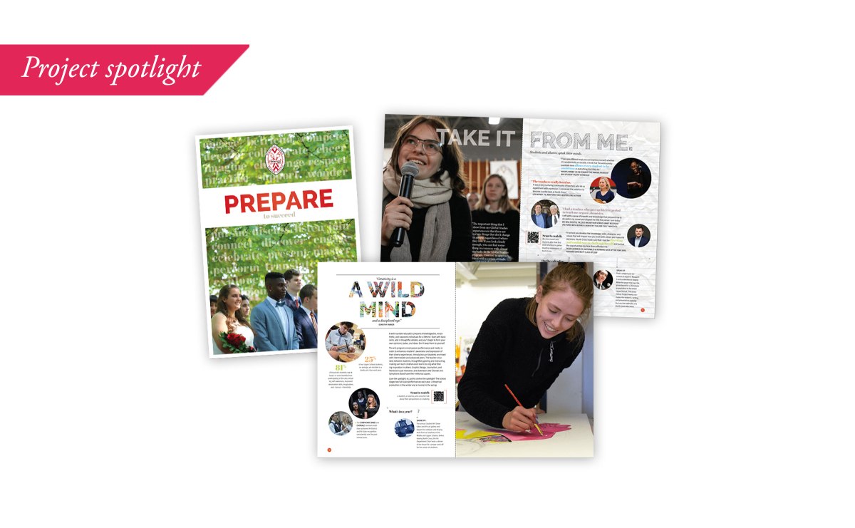
What can you say about a school in 16 pages plus cover? Here, I’ll take you through the three-step process that led to an award-winning view book for a private school in Virginia. Best of all, it was produced on a shoestring budget.
These days, when everything seems to be on the screen instead of on your coffee table, it’s hard to convince a client to invest in the permanence and increased cost of a printed piece. Such was the case with the Pre-k through grade 12 school with whom I worked in Southwest Virginia. As most small private schools, the institution was cash strapped in the marketing department. However, the need became apparent that there were students to woo, and convincing a family to part with a significant portion of their income as an investment for their child’s future when the alternative was “free,” needed more than a slick website. It needed a tactile, emotive connection with families. Enter the view book.
Fifteen years ago, all private schools worth their salt (and their tuition) had a view book. Then websites got fancy and easy to navigate. Families who were going to send their child to a private school did their research online before even picking up the phone to schedule a tour. The view book seemed to lose its place in the marketing lineup. This sidelining was a mistake for those institutions who were aiming to convince families who weren’t sold on paying for school. How can you make a meaningful connection with a family who isn’t even looking for you? Advertising? Sure. But that will only peak an interest and has limited space and audience attention.
And, what if you wanted to woo families across the globe, as this school did? Reaching those families via digital marketing is challenging at the very least. The school realized it needed to go on the road, or on the plane, as it were, but they needed something to hand people that would connect with them and stick. Three steps happened to make sure they had what they needed.
1 Harness the voice, but don’t babble.
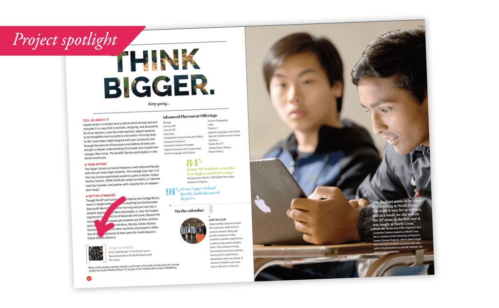
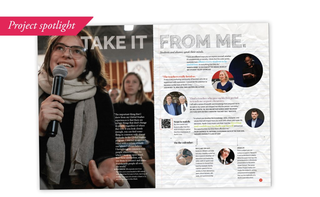
At the time, I was lucky enough to be the marketing director at the school, but I also had substantial experience in designing and producing long-form brochures for schools—though, to be honest, I had never written one. The budget did not allow for a copywriter, so it was up to yours truly to figure out what a family wanted to hear and how they would want to hear it in order to believe this school was the option for their child. I took inspiration from our social media channels. I had created a voice that was serious in purpose, but playful in execution, reminding families that this school is a place that not only sparks imagination and learning, but happiness as well.
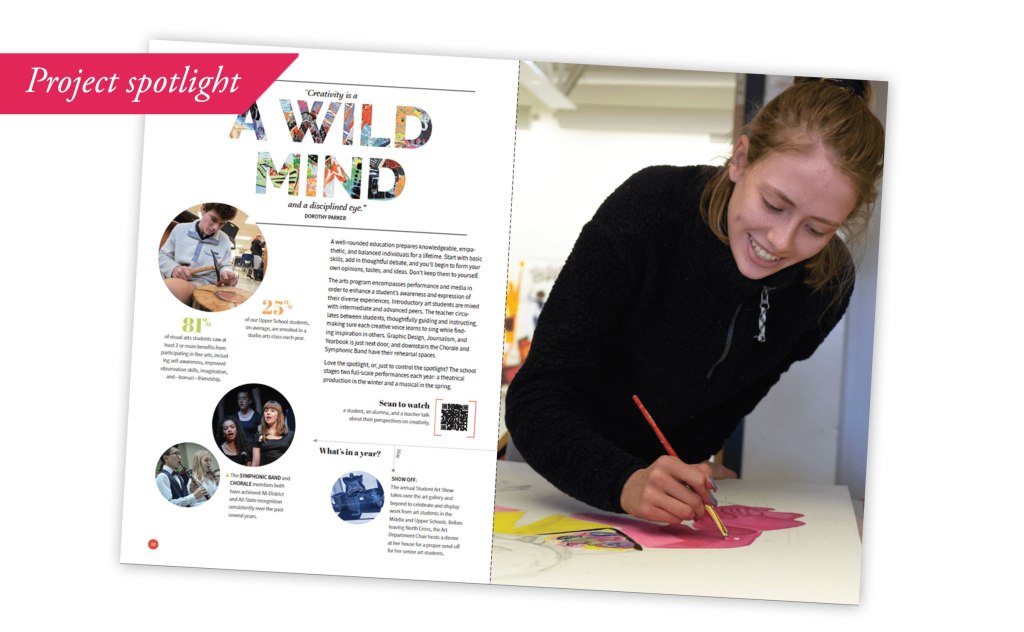
So now, I had my voice. But, people hate to read these days, so I needed to keep the copy short and sweet. And, what about those people in far-off places whose first language is something other than English? I had to figure out a way to entice them as well. Enter step 2.
2 Take advantage of technology, even in print.
Not only did I make sure to employ big, beautiful photography of our students learning, creating, socializing and succeeding, but I used technology to fill in the gaps between picture and text. QR codes are becoming more widely used (especially during the pandemic when no one wants to touch a menu), and so I employed that tool to point to videos of our students doing what we say they do.
One in particular, took scanners to a Facebook post of a high school student performing a rap to a popular song using lyrics of her own creation to explore a historical figure’s biography. This quick link showed prospective parents and students that the classes were innovative, fun, and engaging. Now, how do you get parents and families to get the complete picture in a small brochure? Read on.
3 The dance is in the details.
So, I’ve already explained that people hate to read, but they do like to browse (thank you, Internet). The design brought in many elements from student quotes, to traditions (made appetizing through the use of a footer called “on the calendar”). The headers changed with each spread, some were filled with pictures, some were handwritten, but all had the same style for consistency. Some facts and figures were even generated from data collected by a student working in an independent study on marketing—again, showing that the students learn through real-world work not just concepts.
When all was said and done, the book, produced through digital printing in a small run, achieved what it set out to do: Give the school a sense of legitimacy of message. Offer families something emotive and tactile that reminded them of its unique qualities without opening a browser window. Finally, it positioned them as a preparatory school who had a lot to say but kept in mind what mattered to families and focused its messaging there, no search engine required.
