*Welcome to my new acronym: Slow The F*ck Down. Let me explain.
It may be my perimenopausal cranky talking, but I’ve noticed something in my professional and personal life that makes me want to yell to the heavens on a regular basis for people to, you guessed it: Slow The F*ck Down. Here’s why. I work in an industry that has become increasingly impatient for the end-product. Partially it’s our fault as an industry. We created digital publishing applications which has made the speed at which publications, logos, websites, what-have-you appear super fast. Add in sites like Canva and the like, and a person can almost see what they’re getting BEFORE they even design it. It almost seems like they’re trying to put us careful considerers of kerning and white space out of business (cue hand clutching pearls). But alas, it doesn’t always work that way. Let me show you a perfect example:
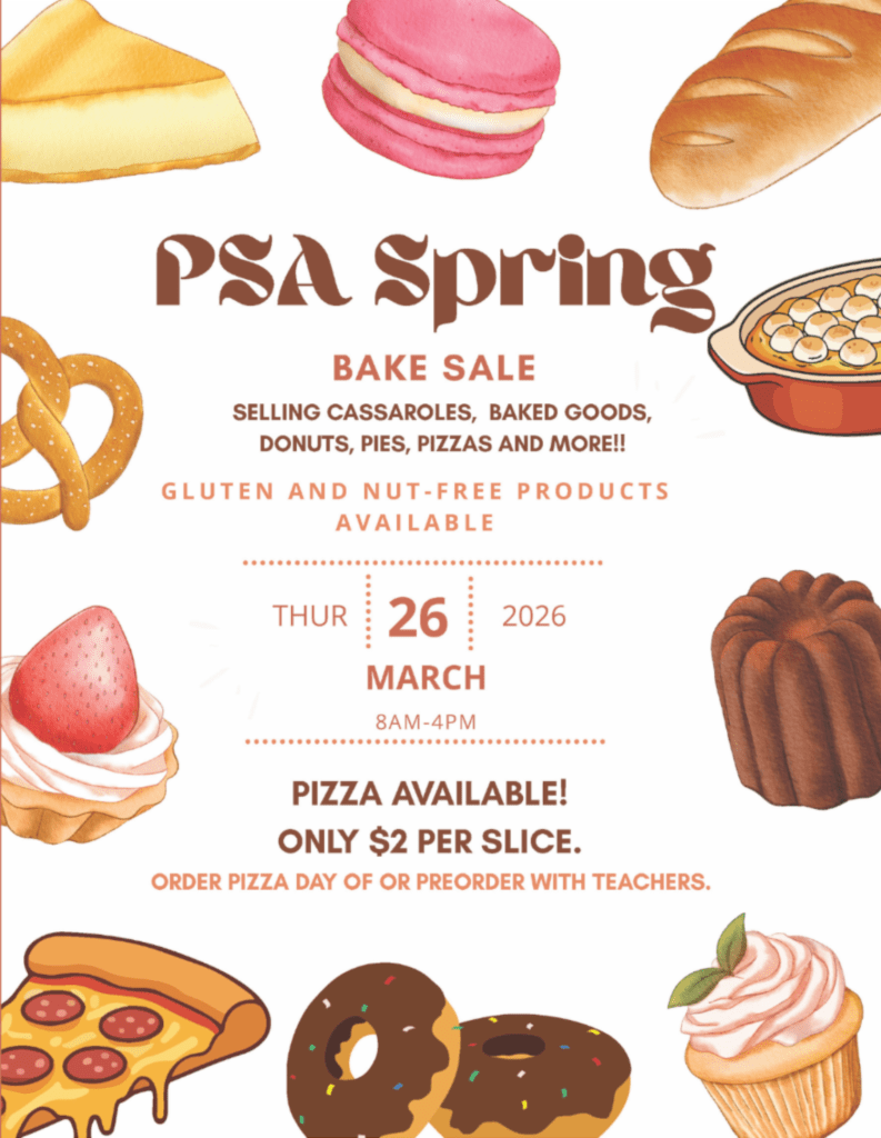
Above is an example of a graphic from an email I received from our son’s school last week. Don’t worry, no egos were harmed during the making of this post. But I wager my coveted one-glass of wine on a weekend night (thank you, perimenopause) that this was made using Canva. Someone found a baked goods template and decided to morph it to fit their needs. What illustrations stand out to you? If you said the casserole, pizza slice and donuts, good for you! You slowed down enough to trigger your kindergarten “some of these things are not like the others” sensibility. Someone needed to make sure they covered all of their baked bases and did some clipart scouting—never mind if the styles match. (I’ve also worked these bake sales in the past, and not once was there a pretzel or tartelette, just saying.)
What about that typeface for “PSA Spring.” Someone (not a trained designer, I would wager), took the headline font for the template and ran with it even though it evokes a trippy Arabian Nights book cover design. Also, is the point of this graphic to promote “PSA Spring”? Is that like a friendlier Arab Spring? What’s the lead here?
Don’t even get me started on the colors. When I squint at this, I see “PSA Spring … Pizza Available! Only $2 a slice!”
My point of this critique is not to rip apart a novice design, it’s to shed light on the fact that just because these tools are widely available doesn’t mean everyone should use them. I’m all about efficiency and I’m a big fan of some of these AI image generators when I’m sketching designs. However. STFD. That’s what good designers are trained to do. We look for the best way to make a message surprising, delightful, and most important, digestible. Creativity is a slow process, as it should be. We need to embrace our originality, trust those who made this their life’s work, and not just settle for what the search bar delivers to us. Only then will the noise and slop settle to the bottom and strong messaging and visual beauty rise to the top.
Take the time, before the times run away with you.
